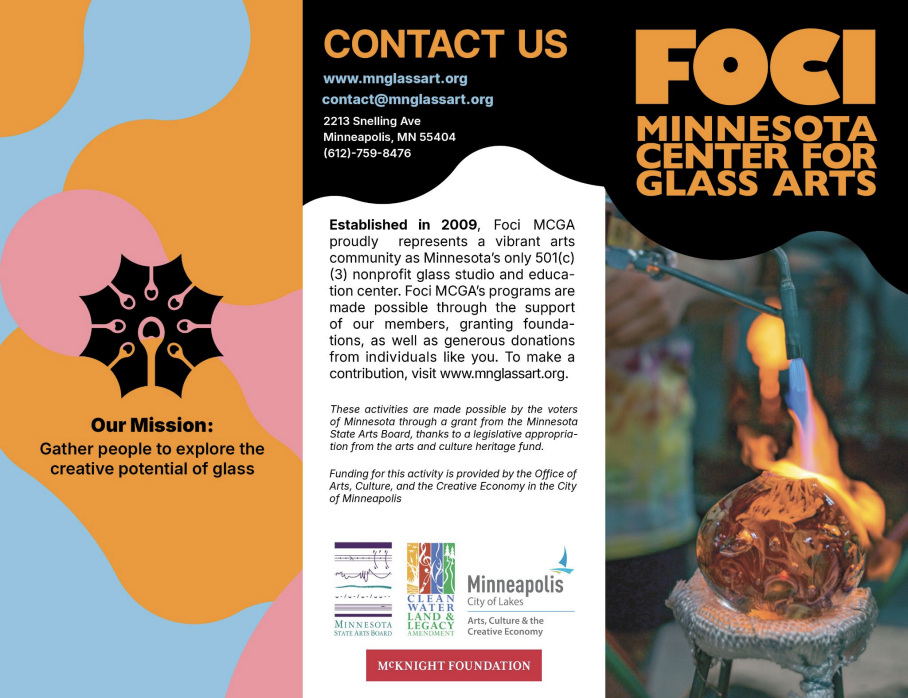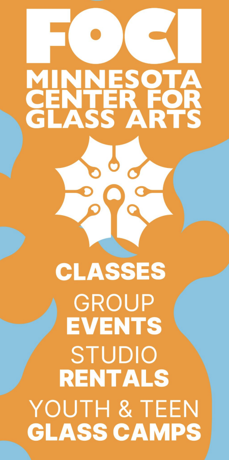
Foci MCGA is a non-profit organization that aims to lower the barriers of access into glass art. This includes classes, community showcases and studio space rentals.
I worked with this company as part of a team of fellow students, my responsibilities were perfecting their current logo mark and unexpectedly coming up with the language that fueled our visual language.
The core word that could describe everything Foci was doing was fusion. From there everything just seemed to click for us.
fusion
Fusion is the act of combining two or more components to create a new, single entity. It is also a method of combining glass in glassmaking. Foci is a fusion of all different glassmaking disciplines under one roof such as glassblowing, flame work, neon, etc. But most importantly, represents everything that Foci does for the community. Foci is a place for people new to glassmaking and for seasoned artists looking for a studio. Together, people from all walks of life come to one place to interchange ideas and skills.
With fusion as our core value, we designed with that in mind. Creating a colorful, psychedelic, lava lamp-esque graphic identity for Foci. Without further ado, allow me to introduce you to the Blob.
The Blob
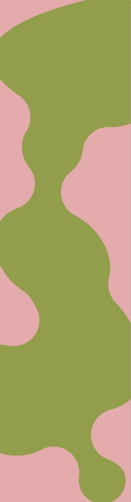
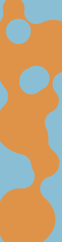
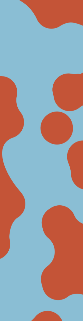
Goofy name aside, the Blob is the key graphic to Foci’s brand. Meant to invoke molten glass and of course fusion. We went with a bright color palette as well, hoping this funky design would help draw in the next generation of future glass artists.
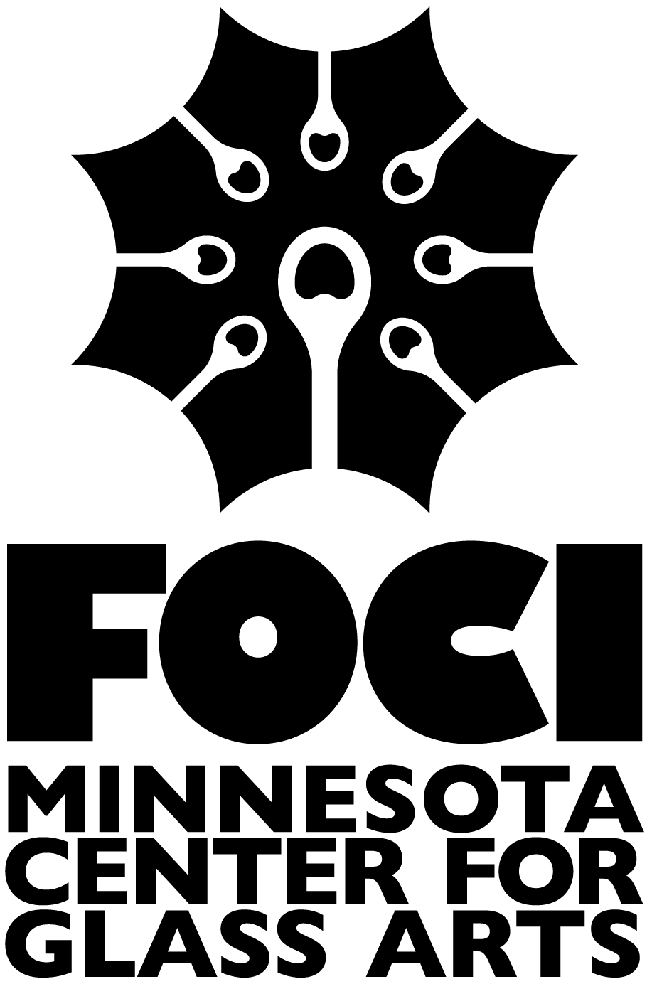
Logo Mark
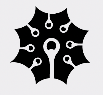
Original mark.

Updated mark.
Foci’s logo, or burst mark is an octagonal shape featuring eight punties (metal rods used to hold soft glass in glassblowing). It’s a symbol that shows not only the most flashy and well known glassmaking discipline, but also the collaborative nature Foci promotes. Foci wished to maintain this mark rather than have a complete overhaul of all their assets, so instead we simply tweaked it a bit to make it symmetrical.
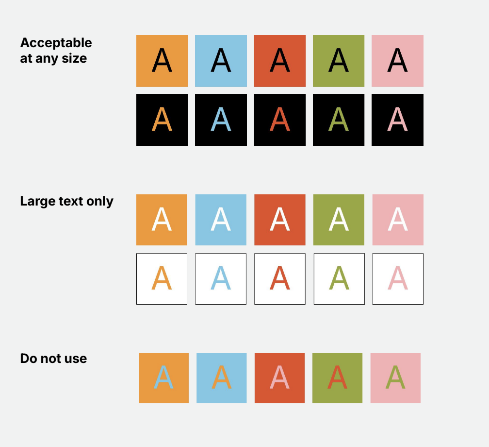
Accessibility
As a non-profit, Foci has certain regulations they have to follow to keep their non-profit title, such as accessibility standards. Every color and type choice had to be tested for readability which made things hard at times, but it was an amazing learning experience. Our color palette could be used with black type or as type on a black background at any type size. White type on a colored background or vice versa was acceptable at large font sizes. Color on color was a no-go. I have to admit I never really thought too much about it before this project but I’m glad that I did.
Applications