Panache is a company of 3’s. Three sectors, three geographical and cultural influences, and three core values that makes up what Panache does. But at the center of it all is the humble yet quintessential apple.
Alongside another student designer, I was tasked with a tall order, create a holistic brand identity that included juice and technology. In the end we created a brand system that touched on all three core values.
Values
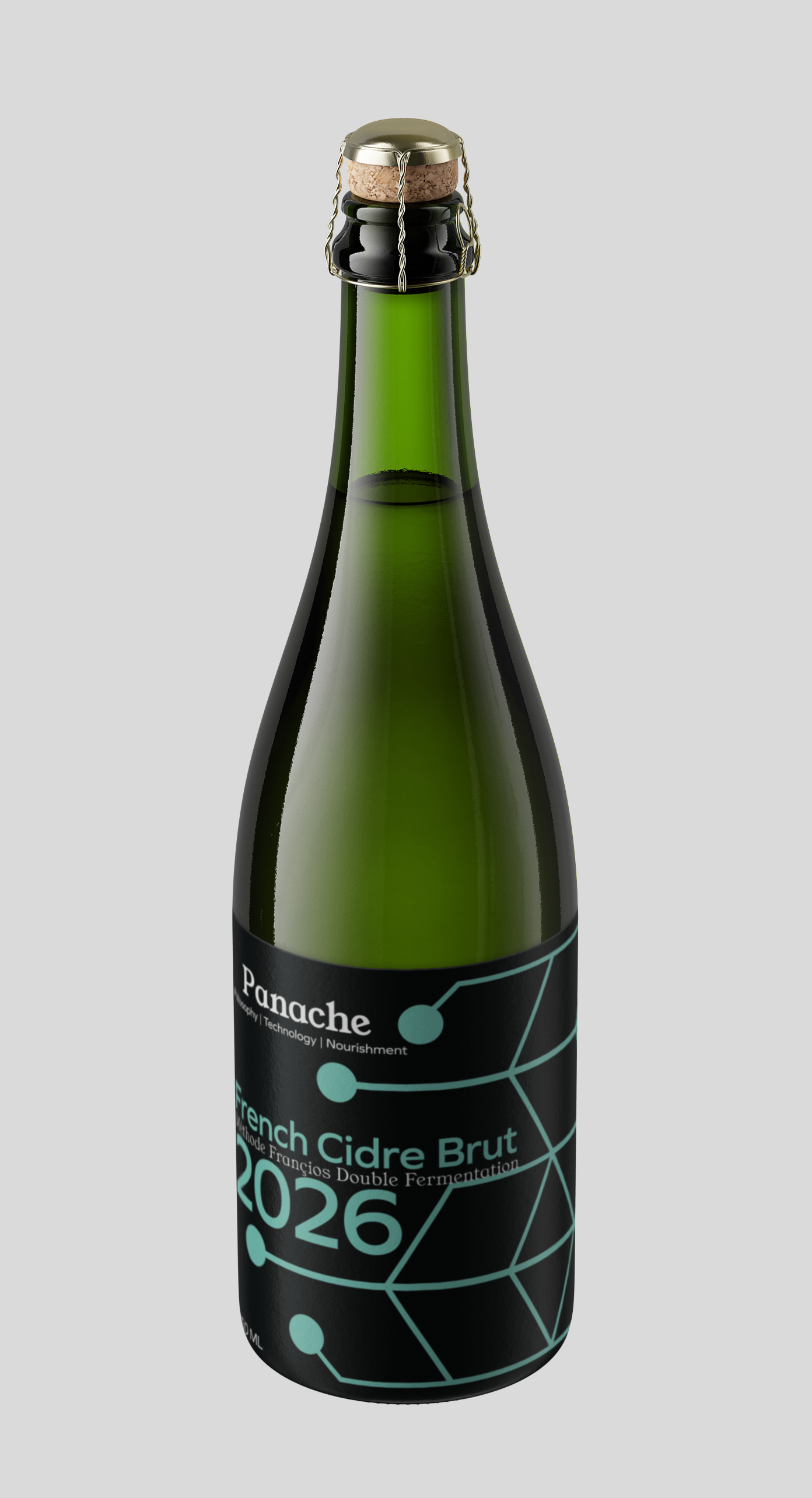
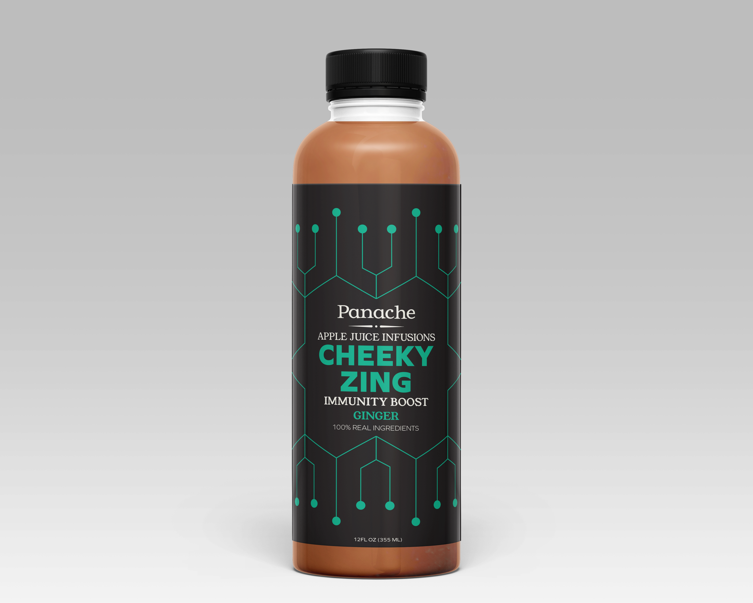
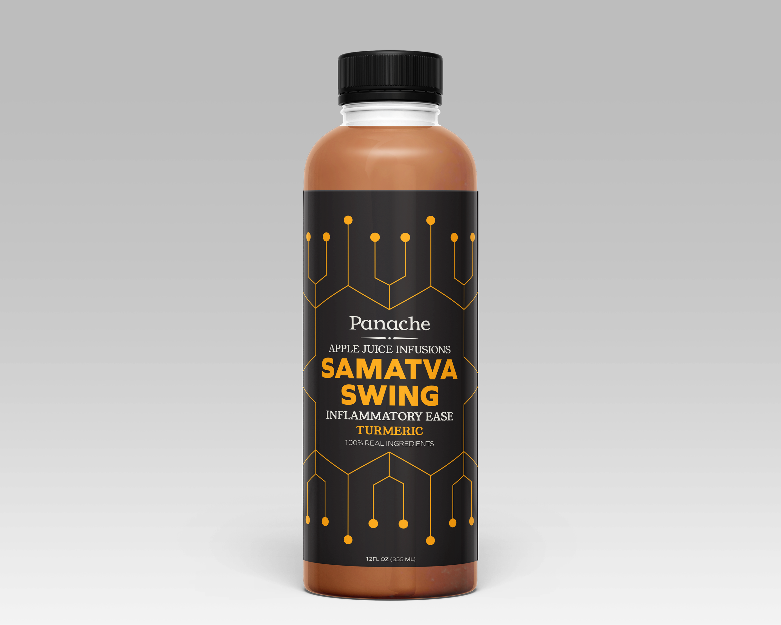
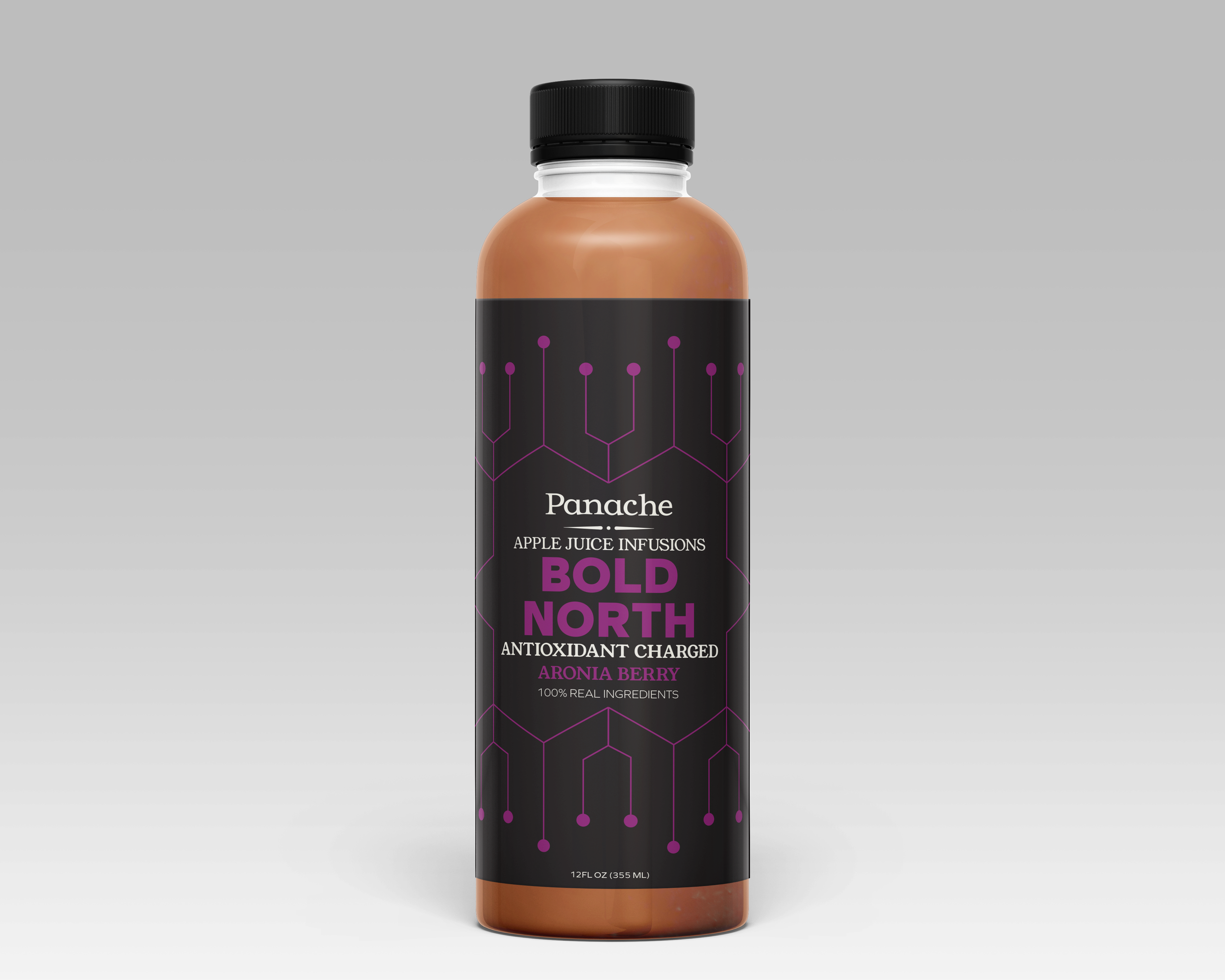
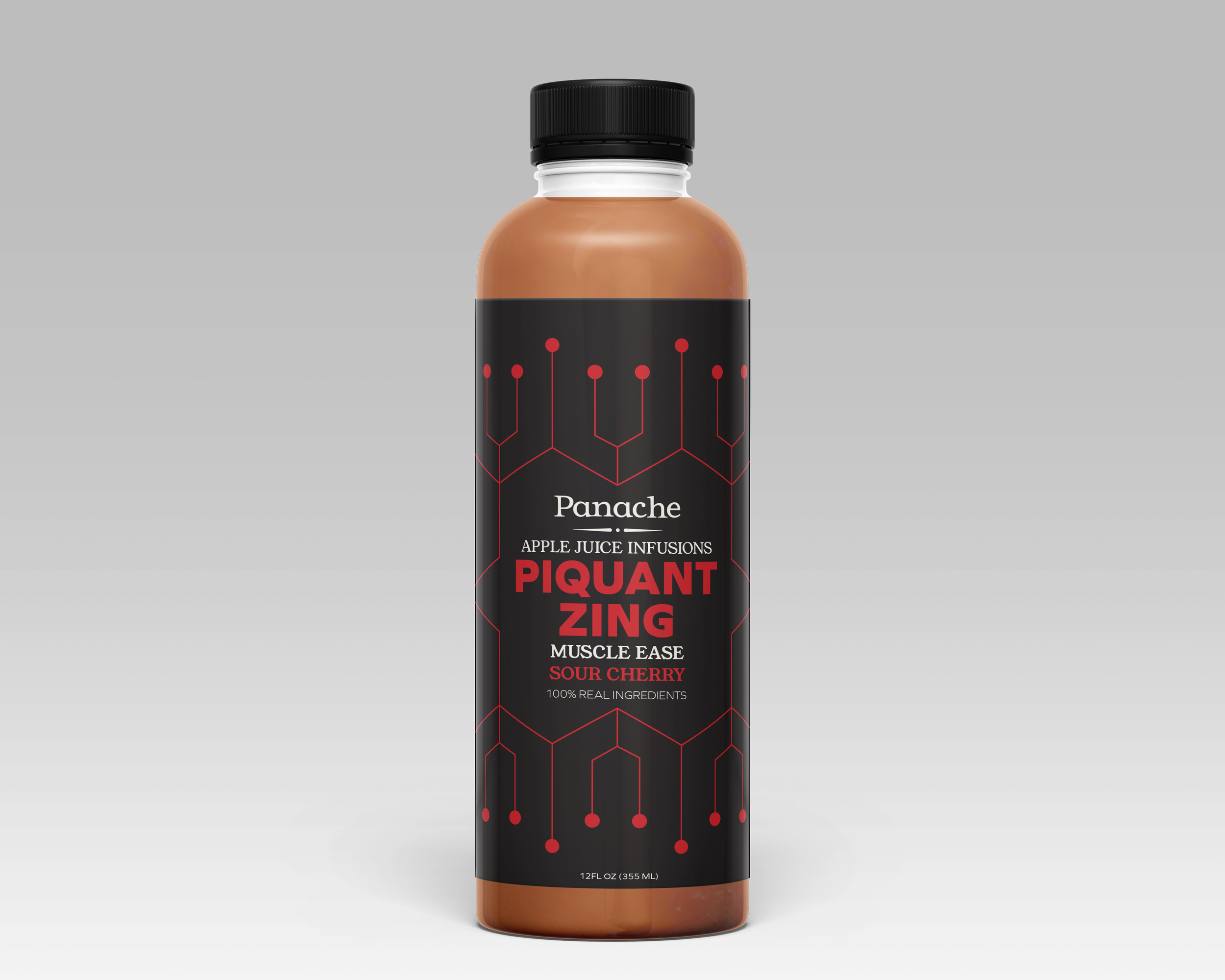
Panache is a combination of Ayurvedic food science, French fermenting, and Minnesotan technology. With its newest sector in agri-tech, Panache reached out to us to make their proof of concept a reality in their brand. While I cannot show these concepts due to patent-pending issues, I can show how this influenced how we redesigned packaging for their juices and ciders.
First came the values that would inform these visual decisions. We settled on three. Philosophy, as Panache’s recipes are based on 3,000 year old methods from India. Technology, for Panache’s expansion into agri-tech and ai software. Nourishment, because Ayurvedic recipes are all about simple ingredients with big benefits to balancing the body.
Color
While only used as “pops” of color, we choice bright, saturated colors that would draw in the eye of the consumer while also retaining the values of the company. Warm, golden yellow to represent philosophy. Leafy green for nourishment. A colder aqua to represent technology. These colors are also used for certain flavors in the juice infusions.

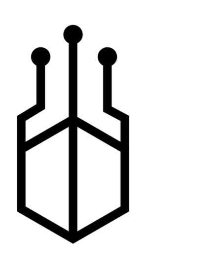
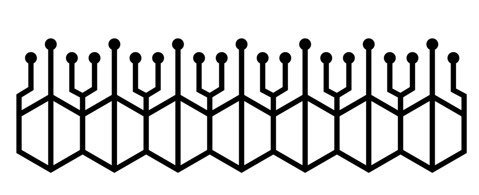
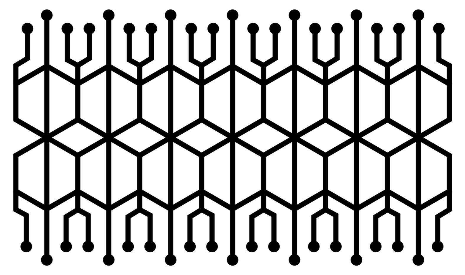
Inspired by circuitry, we created a pattern featuring a hexagon with three traces topped with vias sprouting from it. With this as the base, the possibilities are endless with creating patterns to decorate.
Pattern System
Packaging for Panache